
District 203 adopts new website design
September 23, 2014
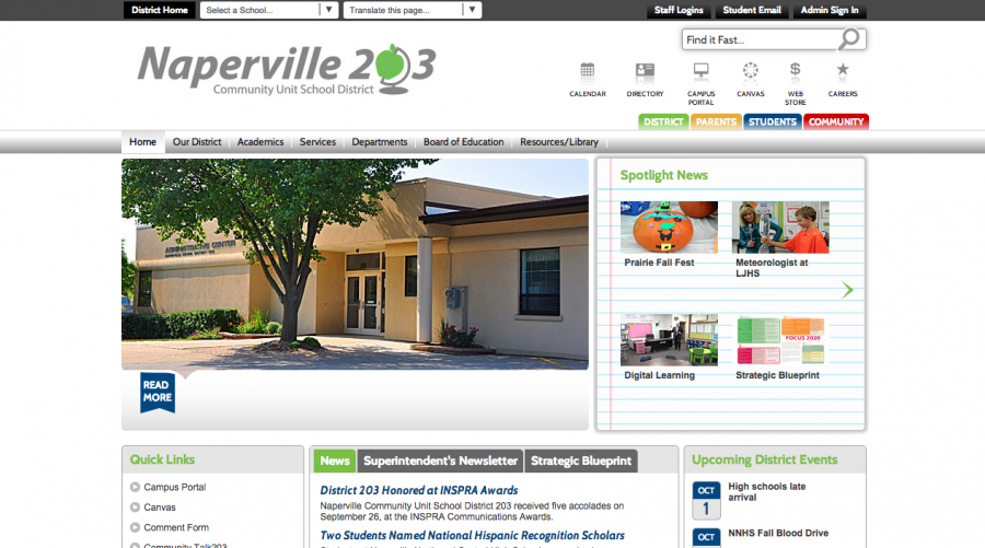
District 203 has launched a new version of its website that also introduces a new logo. To create a greater cohesion between district schools, all 22 school websites have similar looks and design.
Michelle Fregoso, the new director of communications for District 203, explains that before the district changed the website, it received input from district stakeholders to make sure it addressed the needs of all parties involved.
“We asked the stakeholders—community members, staff, students and faculty—what they liked about the old website and what they would like to see on the new one,” Fregoso said. “We wanted to make sure [the website] was user friendly and functional.”
Making the website more interactive was a priority. The district webpage now includes a video tab on the bottom of the page and a constant scrolling Twitter feed on the left-hand side of the page. According to Fregoso, the spread of social media has reached the principals who are now tweeting more to connect with the community.
“We wanted multimedia to be [on the website] so it could be more interactive and more visually appealing,” Fregoso said. “[We want] people to stop by and visit a little bit longer and check out everything that the district has to offer.”
Before officially revealing the website, the district went “soft live” during the summer, opening up the website without any publicity to receive feedback on improvements to be made. The website was officially released when the logo was completely finished.
For the redesign of the logo, the district worked with a local graphic design and marketing firm. The district also held focus groups with members of the community to discuss possible choices. The final decision fell on Superintendent Dan Bridges, who chose from the top three. The new logo features a green apple on a globe stand in place of the zero in 203.
“We liked the apple, since it was something we kept from the old logo, and the green color was cheerful and color neutral,” Fregoso said. “It’s not Naperville Central colors, it’s not Naperville North colors, it’s green! It’s a new logo, but with a nod to the old logo and a little bit refreshed.”
Fregoso said that feedback has been mostly positive. Katie Barry, business teacher at Central, believes that the update on the website was needed, but she still has to become accustomed to the changes.
“It’s going to take some time to get used to it, but the more you use [the website] the easier it becomes,” Barry said.
Fregoso encourages students to connect with the district, may it be through the website or social media accounts. The district website also has a mobile app that can be downloaded.